Branding kit · demo
Harborview Community Outreach
Mark, lockup, favicon, palette, and type for this fictional client — each demo gets its own visual system.
Logos
Civic shield with lighthouse and wave — patch and door-glass mark.
Brushed navy nameplate with the shield beside HARBORVIEW / COMMUNITY OUTREACH.
Favicon
A favicon is the tiny icon in your browser tab — next to the page title, and often in bookmarks and phone home-screen shortcuts. Most people never say the word; they just recognize “your site” from that little mark.
It does not have to match the full logo mark pixel-for-pixel. Marks can be too detailed to read at 16×16. A good favicon keeps the intent of the brand (hall seal, shield, paw, frame, book) in a simple shape that still looks clear when it’s smaller than a fingernail.
Mock browser tab — the small icon is the favicon.

32×32 PNG — designed to stay readable at tab size (about 16×16).
Colors
Hex values from this demo’s palette — each role is intentional for the vertical.
- Harbor teal
#4a9fd8Primary actions and calendar highlights. - Deep water
#1f5f8bPressed buttons and strong rules. - Night pier
#0c1218Evening outreach tone. - Dock board
#152030Story cards and officer panels. - Fog ink
#e8f0f8Body type on dark civic panels. - Mist muted
#9bb0c4Meta lines and hobbies under photos.
Type
Harborview Community Outreach
Display
Teko — civic display with soft industrial energy.
Know your officers · Know your block. Fictional police community outreach with calendar, stories, and officer profiles.
Body
Source Sans 3 — clear neighborhood copy.
Hero image
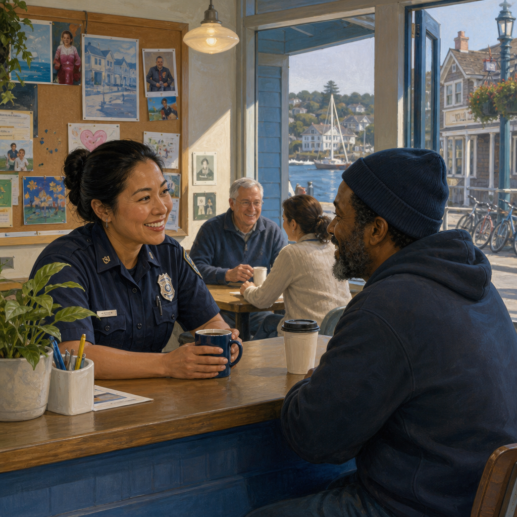
Waterfront civic banner — neighborhood scale.