Branding kit · demo
Mira Vale Studio
Mark, lockup, favicon, palette, and type for this fictional client — each demo gets its own visual system.
Logos
Torn-paper paint stamp with MV brush strokes — studio desk mark.
Torn-canvas gallery label with the paint stamp beside MIRA VALE STUDIO.
Favicon
A favicon is the tiny icon in your browser tab — next to the page title, and often in bookmarks and phone home-screen shortcuts. Most people never say the word; they just recognize “your site” from that little mark.
It does not have to match the full logo mark pixel-for-pixel. Marks can be too detailed to read at 16×16. A good favicon keeps the intent of the brand (hall seal, shield, paw, frame, book) in a simple shape that still looks clear when it’s smaller than a fingernail.
Mock browser tab — the small icon is the favicon.

32×32 PNG — designed to stay readable at tab size (about 16×16).
Colors
Hex values from this demo’s palette — each role is intentional for the vertical.
- Cadmium accent
#d4a0c0Shop prices and gallery links. - Oxide deep
#8a4a6aSold tags and strong rules. - Studio night
#161218Gallery wall background. - Canvas panel
#221c28Piece cards. - Gesso ink
#f6eef4Titles beside art. - Linseed muted
#c4b0bcMedium and price lines.
Type
Mira Vale Studio
Display
Fraunces — soft display for an artist desk.
Paint · Print · Place. Fictional artist site with gallery, sales, and about.
Body
Nunito Sans — friendly gallery blurbs.
Hero image
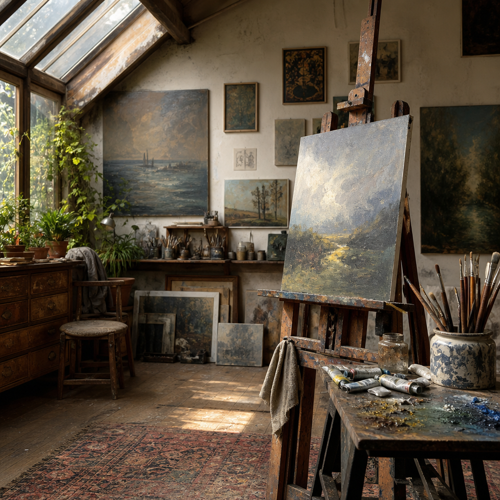
Easel / studio interior — work in progress.